/cdn.vox-cdn.com/uploads/chorus_image/image/66873808/Screen_Shot_2020_05_29_at_2.52.41_PM.0.png)
Tales of Earthsea gets a lot of shit for being one of the worse Ghibli films, and it’s true; it’s not the best. In my opinion, Goro bit off more than he can chew. On the one hand, most people haven’t read the book the movie is based on, so viewers go in without much expectation. I can’t say people go in without any expectation because it is a Ghibli film, after all. But on the other hand, Goro must relay all the important information for comprehension, stay true to the story to appease the author, etc. While I sympathize with Goro, as it must be terrible constantly being compared to his father and his legacy, I think he should have started with something smaller or even just lend a hand to other productions to gain more experience as a storyteller. The art is fantastic as usual, but the plot is boring, and the characters leave little to be desired. The main character, Arren, is interesting because of his inner-conflict, but his dialogue is so bland and monotonous. I don’t know if something was lost in translation in the dub or if it’s the screenplay. It’s reminiscent of Princess Mononoke and Howl’s Moving Castle, but it doesn’t hold a candle to these amazing films. Also, the expressions of the characters a flat with their lifeless eyes. There are no subtleties that hint at their personality.

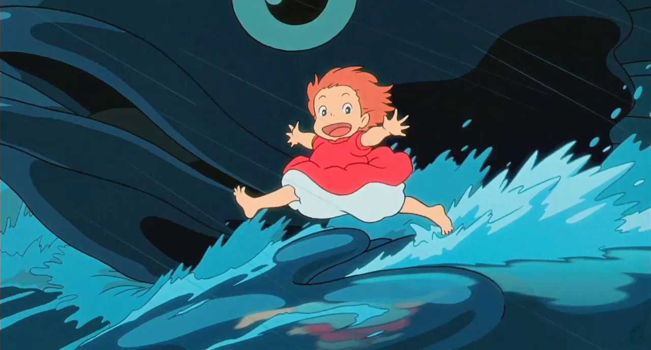
I love Ponyo. If you hate this movie, you don't have a heart, and you probably don't like puppies or kittens. It is adorable, but I'm conflicted. Can I give it a high rating for cuteness? First off, the colors are insane! As someone who loves color, the explosion in rich red, green, and blue shades made me immensely happy. Ponyo is not just any red; she is, according to the internet, Amaranth. You can vividly recall that color when you picture her and this movie, plus she has a great character design: so expressive and curious. I loved those scenes inside Lisa and Sosuke's house because of the details, most notably using colored pencils. The colored pencils added depth and shading, plus softness and grain. The inside of their house oddly reminded me of some of Van Gogh's paintings. Each purposeful scene strives to show reveal more. Despite having a husband that is away most of the time, Lisa remains upbeat and nurturing towards all the people around her. Although Sosuke is young, he acts beyond his age, like when he comforted his mother. Finally, the movie subtly talks about ocean pollution and protecting the earth. I was most looking forward to this movie because it was one of the NHK documentary subjects, 10 Years with Hayao Miyazaki. I thought it would be fun to watch it after learning about it behind the scenes. I highly recommend the documentary.


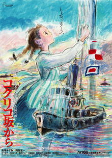
I also remember watching From Up on Poppy Hill in Chinese and being so lost. Wait, there's incest? Is this incest? Incest aside, I was also expecting a different art direction because of that theatrical poster, which I included above. Imagine how cool the movie would've been if it was like that poster? I think it would've had visuals similar to Loving Vincent. I also wanted to rewatch this movie to clear-up my numerous misunderstandings.
My thoughts after watching: this movie was such a pleasant surprise! I was a bit hesitant because Goro's at the helm again, albeit with some help from his father this time around. Maybe it's because I hated Tales of Earthsea so much, but I really enjoyed this movie. He did what I said I wanted him to do in my Earthsea review above. This movie was less ambitious, so the plot and characterization were significantly better. I hope he learned something from this experience to become a better storyteller. No more high-fantasy and angsty, unemotional protagonists! I was surprised by the empathy of this story. Students band together for a cause they are all passionate about, tradition versus modernization, what it means to be a family, parent-child relationships, etc. This movie had me teary-eyed with the mother-daughter reunion and the "it feels like I'm seeing my friends again." The visuals were lovely, but it was more muted and faded. The artists experimented with character designs through new face shapes; the signature style is still present, but they somewhat reinvented the wheel. The common theme of strong women appears and thrives: Umi's mother was pregnant and pursuing her degree! Some characters were cast to the side, which makes me wonder whether it was important to introduce them in the first place. The romance was a bit weird because of the hints of incest and the mutual pining. It's not incest, thank goodness!

I wasn't blown away, pardon the pun, completely unintentional, by The Wind Rises. I loved seeing Japanese history, international relations, economics, and politics during wartime, but this movie felt a tad underwhelming. The movie is so bright and vivid, but there's also grime and grit to the relatively "underdeveloped" areas/areas hit by a disaster. The vivid wartime color scheme was questionable but beautiful nonetheless. The movie demonstrates animation skills during the Great Kanto Earthquake scene: it must have been a pain to animate and draw all the chaos and people. It also demonstrates skill at depicting aircraft flying. But for some reason, Jiro's walking, on occasion/in certain angles, was the choppiest, clunky, and unrefined animation I have seen from Studio Ghibli. The studio manages to capture the light reflecting off the metal aircraft, the subtle curvature on the propellers, the shadows under the wings, but they can't smoothly animate his walking... I understand this might show Jiro's personality, but it sticks out like a sore thumb. There's more aesthetic-borrowing from Nausicaä, Castle in the Sky, and Howl's Moving Castle. There's this unnecessary romantic sub-plot; while it serves as a plot device to uplift Jiro's spirit to encourage him to not give up, the movie really could have done without it. I didn't love the characters because I didn't sympathize with them. They are multi-faceted and complex, but I wasn't engrossed. My key takeaway is: war is both horrific and beautiful. It's devastating, but it also allows one to progress.

No comments:
Post a Comment
Let's discuss!