"Don't judge a book by its cover."
I'm sure you heard this at least once in our life and I'm sure you ignored it. I certainly have. When you're looking for books online or perusing your bookstore, a book with a great cover captures your attention. You click on it/take it off the shelf, read what it's about and you sample it. A book cover is so important-it does more than covering a book.
Almost every book cover relates to what the book is about. Maybe it's an object from the book or an idea. It provides a little insight. Sometimes it's in your face and incredibly literal or it's subtle and abstract. I'm going to mention some of my favorite covers because I'm vain and appearances mean a lot to me.
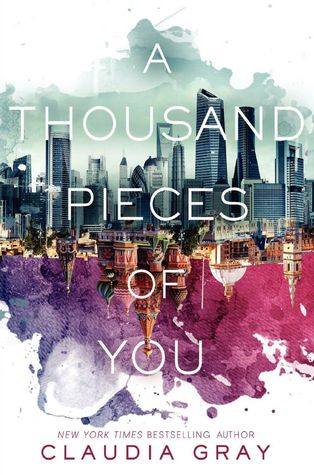
The title kind of makes me want to puke because it sounds like a contemporary teen, romance book about a girl going through a break-up or the death of her boyfriend. But, surprisingly and thank goodness, it's not. The book is about Marguerite jumping around parallel universes to track down this guy. There is a reason to this, but I don't want to explain it because it's quite lengthy and I'll spoil crap. The cover has skyscrapers and a reflection of Russia. It's a little snippet of the story. Seriously, this cover is gorgeous. So is the next book!
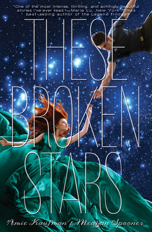
asfkdj... The story is terrible (my review) but the cover somewhat makes up for it. I've seen it at Barnes & Noble and it looks even better in person. The emerald color in contrast with that blue! Ugh, beautiful! The story takes place in space/somewhere in the galaxy. There's romance, bleh, inter-galactic/space romance... In my opinion, this is a coffee table book. Its only purpose is to make your house look good and show your pretentiousness.
My favorite Colleen Hoover book, ever (as of date of posting). It is beautiful. It's a blend of art, romance, emotion and tears... I love this cover. It's a canvas with paint splatters. I love the color scheme and the text masking. When you brush your hand across the cover, you can feel the splatters. It's so "interactive", lol. The book also contains pictures of the artworks mentioned in the book, which makes me so happy because I can't imagine anything.
First of, if you haven't read this book, you definitely should. It's a magical, breath taking story. It's lyrical and has such a nice flow. The story takes place in/around a circus, who's color scheme is black, white and red. *drools because that's beautiful* There's a clock in the circus, it's not significant, but I thought the description of it was absolutely magical. I felt like I was in Narnia and Oz. Then, there's a man and a woman in this book... you know what happens next. The color scheme makes me die peacefully.
I love the neutral colors and the art. The artist is so talented. The wind blowing the clothes and hair makes Vhalla look so majestic. Only in fiction: people looking amazing despite having wind the strength of a hurricane blowing straight at them.
Another book set in space, using the term very loosely. It's more of an alternate universe. It's an amazing concept and it's creative. The story and series is interesting and the characters a likable. Now I can gush about the cover.
OOOOOOOOOMMMMMMMGGGGGGGGGGG
IT'S SO PRETTYYYYYYYYYYYYYYYYYYYYYYYYY
THE GALAXY. THE DRAPING OF THE FABRIC
MAGICCCCCCCCC


No comments:
Post a Comment
Let's discuss!